From the Design Quarterly: Digitally illuminating a city’s utilization
October 10, 2018
October 10, 2018
Data visualization helps cities choose the right path to revitalization of retail and creation of pedestrian-friendly zones
Seeing a city’s architecture is one thing, its infrastructure is another, and its people are another. And then there’s seeing its data—such as how many people go where and do what in which buildings at any point from sun up to midnight.
The latter can be illuminating.
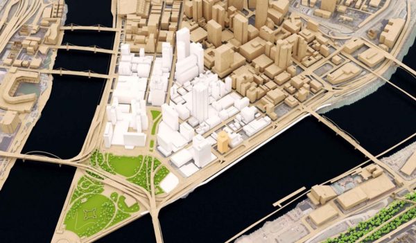
3D model of the golden triangle in downtown Pittsburgh, Pennsylvania.
When the Mayor of Pittsburgh and the city’s Downtown Retail Task Force wanted to know where to focus their efforts on revitalization of retail and pedestrian-friendly areas such as the Smithfield and Forbes corridor, they first need to understand the utilization, and lack thereof, of the downtown district. Leveraging data from the city’s detailed utilization studies, we created a virtual 3D model of Pittsburgh’s golden triangle. The city hoped to take this data and look at opportunities for developing the area in a manner that would activate it to unlock its potential.
Photorealism isn’t the goal here, communication is.
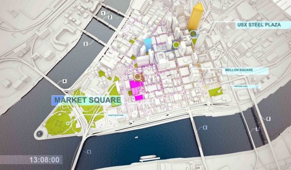
The use of 3D digital visualization and animation technologies presented the information to a broad audience, from the client through the engineers, in an easily understood medium. These data visualization tools create a common ground, enabling participants from various back-grounds and knowledge sets to contribute value to the wide array of potential solutions using a data-driven, decision-making process. Two dimensional forms of representation tend to generate gaps in information and understanding when you consider the multi-dimensional nature of the challenge at a city or district scale. In plan, the utilization information is only identified on a two-dimensional plane, at a single moment of time.
Particle crowd simulation animation showing attraction areas for the simulation. The size of the label illustrates the strength as an attraction at a specific time of day.
For the Pittsburgh revitalization project, we pumped all the city’s data into a 3D model, which we programmed to illustrate utilization over time on a typical day. As the information changes over time, the data drives animation within the 3D model in forms of color, motion, etc.
How many people are going where?
Which storefronts are vacant? Which are active?
What’s the traffic count through the area?

Visualizing a walkable city. The particle crowd simulation animation shows areas within a 5-minute walking radius. The graphic illustrates the proximity of three major downtown towers and the amenities in between.
Photorealism isn’t the goal here, communication is. Why is this visualization so effective as a tool? In our meeting, stakeholders and consultants from diverse backgrounds—politicians, community members, developers, architects, designers, transportation experts—all scrubbed through the model, hour by hour, to experience how the city changed on a typical day.
It was live, and powerful. And the shared experience immediately jump-started the conversation about the key issues and concerns of the participants. No time was wasted in discovering the right path to revitalization.